Jul 11, 2019
Cleaning up a logo
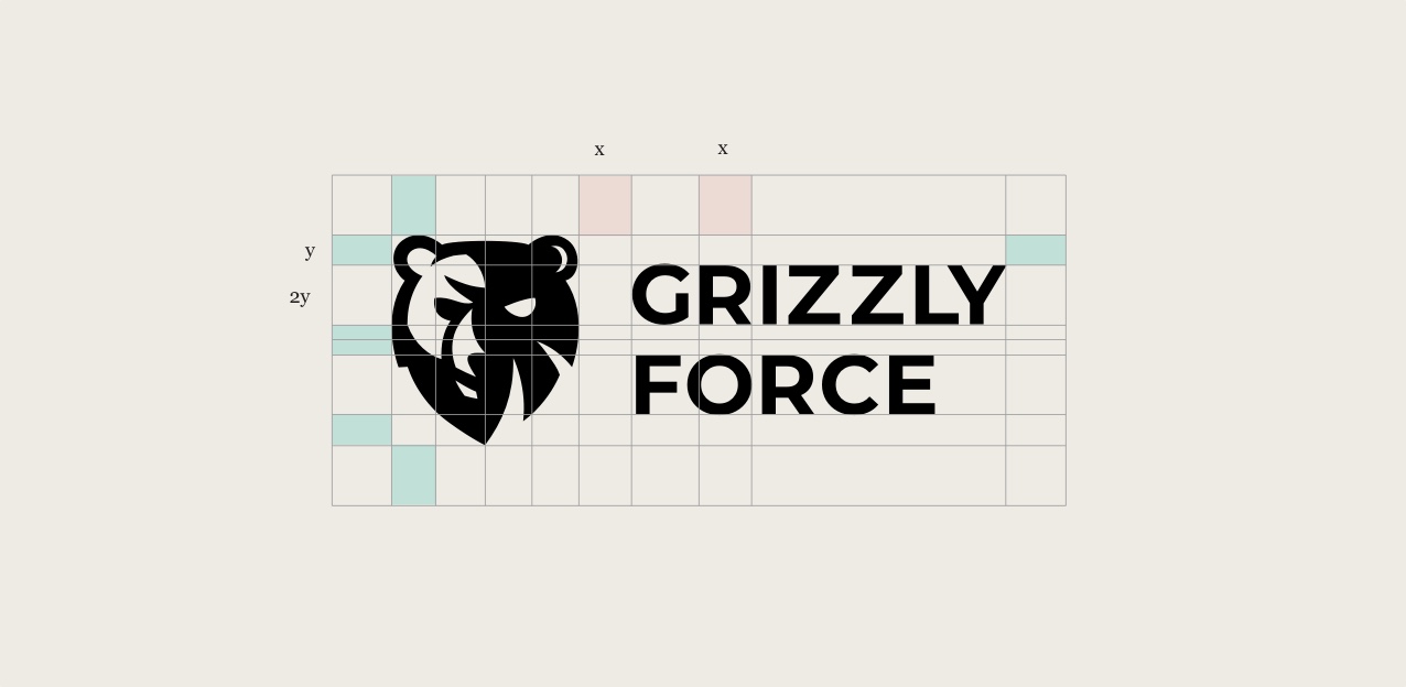
 The final Grizzly Foce logo in it’s spacing system.
When I started working with Grizzly Force, they had contracted out their identity design well before there was any product, website, or marketing material—as most companies do early on.
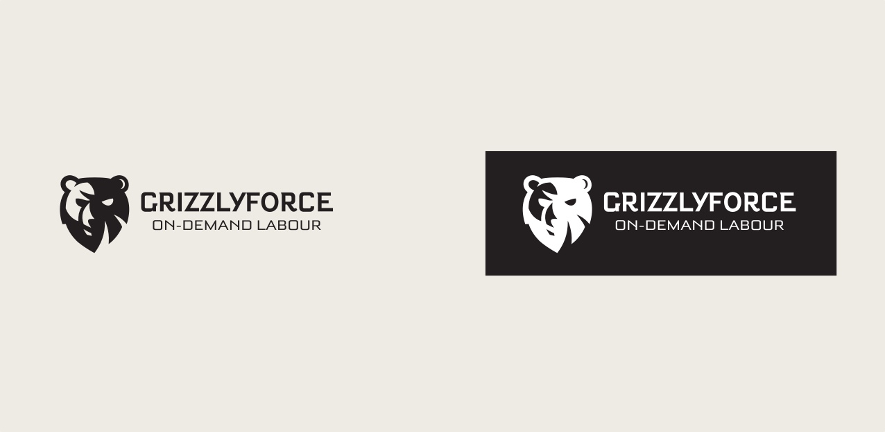
However, after the website, product and brand began to develop, the identity felt further and further detached from the tone that was being established everywhere else.
 The original Grizzly Force identity.
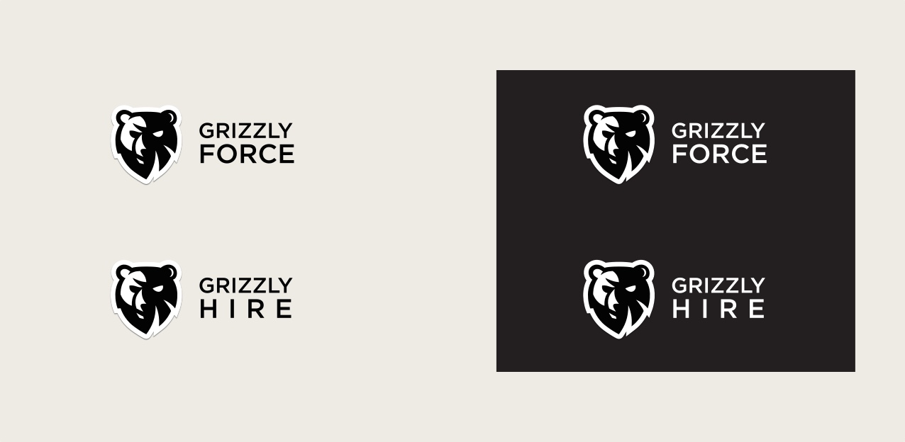
Originally hired to design the platform, I made the decision to split functionality between two separate apps to keep the experiences focussed for each type of end user: workers and employers. As such, we decided to name each app ‘Grizzly Force’ and ‘Grizzly Hire’ respectively.
Using ‘Grizzly’ to keep each entity grounded to the brand, we made the second word dynamic to the problem space it was serving. This left the door open as a naming convention for future products we may look to create— á la Uber Eats, Uber Freight, etc.
As the only designer on the team, I rather quickly whipped up some identities for each. I felt Montserrat was a better match for the weight of the bear logo and it also provided a typeface that could be extended to marketing material as well as the digital products we were building. To emphasize the dynamic second word of Force and Hire, I chose to break them out onto a separate line, increase the font size and then played with the kerning so that the text was justified. This never really felt right but at the time my efforts were focussed more on designing the applications as opposed to the brand.
In addition to the Force / Hire distinction, I also wanted to solve the problem of the brand’s identity on dark backgrounds. Unlike many other brand identities that simply swap their main colour for white when used on dark backgrounds, the Grizzly Force bear logo looked entirely different than it’s white-background counterpart (see above). To make it more uniform across collateral, I decided to add a white border with a drop-shadow to maintain consistency no matter what background colour it was featured on. This was circa 2016 so I admit I may have been a little too influenced by the material design trend at the time.
 My Material-inspired take to soften things up a bit.
The sharp lines and edges of the original bear logo with the angry eyes made the brand feel inaccessible to a broader audience. The thick, round corners of the white outline helps to soften the identity and make it less aggressive.
After some time in the wild, the Grizzly Force brand name was becoming diluted to just “Grizzly” and the distinction between the two apps amongst our different user bases was becoming more and more confused—workers were downloading our employer app and vice-versa. To combat this, we wanted to reinforce the “Grizzly Force” name for better app store search results and brand consistency/awareness. We decided to drop the “dynamic second word” of Force and Hire and keep all properties under “Grizzly Force”. To separate the two different solutions we opted for a new naming convention: Grizzly Force - Work and Grizzly Force - Hire. This allowed us to use one identity, everywhere and make the distinction of properties through the meta data of titles, descriptions, colour schemes and context.
Now that I have been working with the brand for a while I decided to carve off some time to clean up the spacing and usage guidelines of the identity so that it can more easily scale over time. I had never studied spacing and proportions of word marks and identities before so this was a good opportunity to analyze and learn.
Using the system of spacing that’s featured at the top of this post (see the hero image) I managed to create a an identity that is cleaner and more balanced for usage across many different properties.
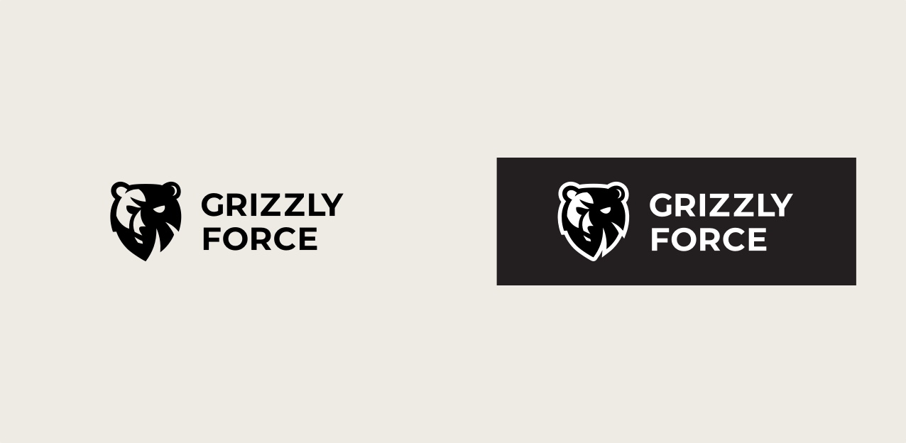
 The final horizontal identity.
↘
Want to learn more?
I’m planning to write a summary of what I learned about logo spacing and the simple process you can follow to find the proper spacing for your own identities.
Let me know if you’re interested in