Mar 3, 2015
More templates and background image properties
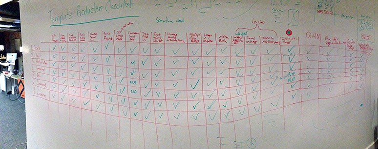
Traditionally (as in the first few years of Unbounce), template development was quite the arduous process where our Creative Director and Design Director would get together and plan out every detail of the page. Layout, color scheme, and copy would be selected to suit Oli’s Conversion Centered Design principles and over a couple weeks of brainstorming and iteration, the makings of a landing page would be scrawled out on a whiteboard before making their way to Denis’ screen. You can see a more in depth look at this whole process here.

Now, there has been a lot of change over the past year or so. Oli has moved out of his position as Creative Director and has taken on a bit of different role on the road. Our Creative team has grown from 1 to a team of 4 designers and 1 developer. With this larger design team, we have been able to develop even more awesome things for customers like Unbounce Academy, CTA Conf, Conversion Road Trip and the mind-blowingly beautiful unbounce.com redesign.
Unfortunately, with so many creative projects in development, new templates had to take a bit of a back seat. I say “unfortunately” because “MORE TEMPLATES” is still one of the most requested features/improvements from our customers. As a company that prides itself on building what our customers need, we really dropped the ball in the templates department. For that, we are sorry.

It is expected that a growing company will experience growing pains and this just happens to be one of ours. In the past, templates were owned and spearheaded by just two people, but as teams grew and changed, we had to start questioning where this responsibility would end up. Was it Creative’s deal? Maybe Product should own it.
But wait… Doesn’t the Product team have a lot on their plate? Like new features? Where’s my Marketo Integration?!? Lightboxes dammit!
Yes, the Product team does have a lot on the go and is actively working on shipping new features; but you know those times when life gives you lemons and you make the most delicious of lemonades? This is one of them.
For the last 3 sprints our Page Builder team has been working on a “Design Empowering Feature™” that gives customers more options for Background images!
These options include: Parallax scrolling, image stretch to 100% full screen width, and color overlays!
This was a move to allow our customers to do more awesome things with their pages and help them to keep up with design trends. Or as Product Manager Paul Doerfling says,

That’s it. Giving you the power to make really cool pages without having to code IS our reason for being. Howweevvveerrrr… Going back to the original topic of this post, we still need to give you “really cool pages” to start with and we haven’t done that in quite a long while.
So we decided to make some delicious lemonade.
This was our recipe:
- Build Design Empowering Feature™ in the Unbounce Page Builder
- Get Unbounce designers to test out the Design Empowering Feature™ and make some new templates.
- Enjoy lemonade.
If you didn’t get it from that rock solid analogy above, we decided to use this feature’s launch as a motivator to get our customers some updated templates.
Now, as I mentioned before, template development has traditionally been a pretty lengthy process. It required a couple people to dedicate their time to come up with page layouts from square one. At the moment, our resources are a little pre-occupied with ongoing projects so we have opted to approach it from a leaner, shotgun-ier approach… Hopefully without sacrificing quality.

On the second last Friday of every month, the designers from both Product and Creative take the day to do a “Template Slam”. The goal being that everyone designs (and builds) a CCD-solid-template by beer o’clock. In so doing, we should be able to release about 5 new templates per month, at least.
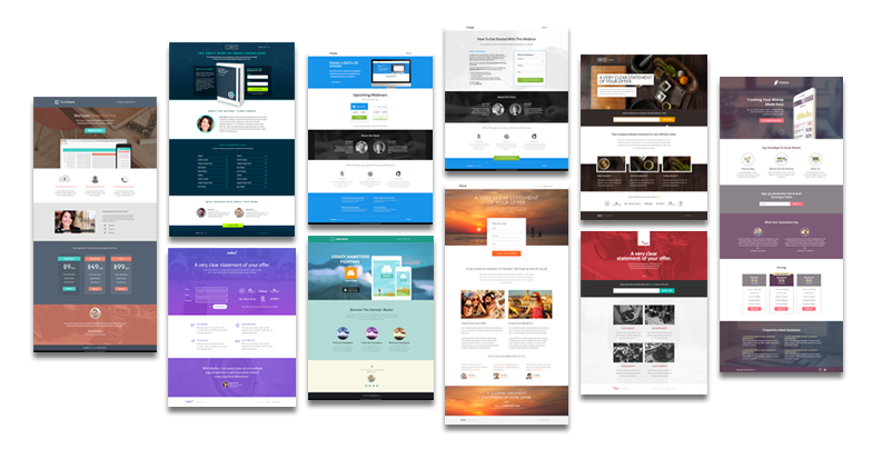
For the first Slam, the theme was to create pages that made use of the new background image effects. Each template uses at least of one of the new properties we added: Parallax, 100% full screen width, or color overlays. Some of them even use combinations!

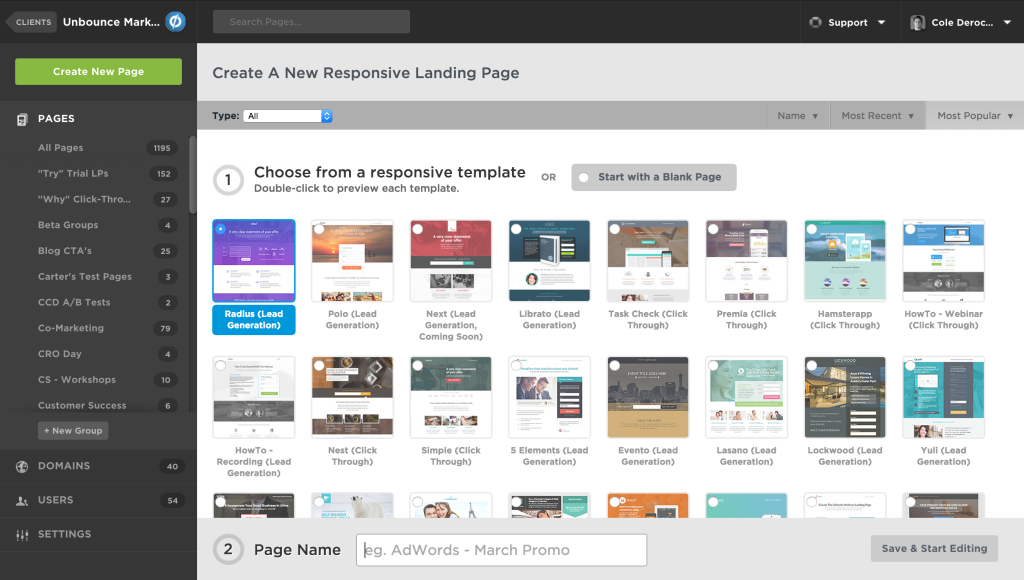
[TaskCheck(https://templates.unbounce.com/task-check-click-through/)] | Librato | Radius | HowTo1 | Happster | HowTo2 | Polo | Nest | Next | Premia
To ensure we built relevant templates, we enlisted the help of our Customer Success team who are in regular contact with customers and hear their requests first-hand. To start we were given the request for more:
- Improved Pricing pages
- Startup pages
- Marketing generic / General Business
- Mobile App
- Coming Soon
- Ebook
- Travel
- Real-estate
- Educational / E-learning
- Medical/ Pharmaceutical
We were able to tackle a few of these in the last couple slams but the remaining will be left for future ones.
The Template Slam is admittedly a quick fix for what has been a consistent request and it is not the only thing we are doing for template development moving forward. Our goal is that these releases will help facilitate conversation around what our customers want so we can make sure our templates are as tailored as possible.
We have a ton of resources at our disposal in terms of page design and we are going to start making use of every opportunity available. We want you to go to bed at night knowing that more Unbounce templates are always on their way.
This is just the first phase of Operation: MOAR Templates.

Originally published at inside.unbounce.com on March 3, 2015